Why is the Logo for the City of Prince George Turning Up on Skateboard Clothes?
Posted on 7 September 2010
via Shawn Petriw on Facebook:
“I’m always amazed how artists working completely independently can create something so similar. It’s happened to me, and apparently, it’s happened to Slingshot. Add a dogwood on top and you’ve essentially got the City of Prince George logo.”
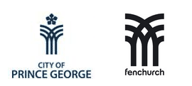
This is what he means. Here’s the logo for the City of Prince George side by side with the logo for Fenchurch, a skateboard-clothing company:

For those of you who don’t know (and I’m not surprised there would be those who don’t, since it’s impossible for me to find a link on this [update: link is here]), the City of Prince George’s logo is a dogwood1 (British Columbia’s provincial flower) over top of an image that represents the coming together of the Nechako and Fraser Rivers. It’s pretty cool, actually, but vague enough that it can be interpreted in many different ways. For example, most people I ask think it’s a snowflake and some random lines. Slingshot, the company that created the Fenchurch logo describes their design thusly:
“After submitting many ideas and sketches for the Fenchurch logo, the arch design was conceived. There are many ideas behind the design, the first being that it comprises of two mirror images of the letter F. It has a very strong and solid feel and its architectural forms are vaguely reminiscent of the arches and stained glass windows found in churches and the main one being a graphic representation of the train tracks of Fenchurch Street Station.
The logo is in no way pictorial or literal and therefore does not limit the the products that the company produces, it has already experimented with shoes as well as clothing and offer many accessories that are not necessarily related to clothing. By creating a logo that was in a way anonymous it means that Fenchurch is not limited to the clothing market alone.”
But even Fenchurch is not alone. It seems Mr. Petriw brought the similarities of the two logos to the attention of the designers, who, according to Mr. Petriw’s Facebook page responded:
“Ah yeah, you know since I did that logo in 2000, I’ve seen several that are similar. Must be zeitgeist! Or maybe because it’s a form that can represent many things. The worst one for me was when I went to Paris two years later and walked past the 30 year old Les Quatre Temps mall, check it out:

– thankfully that’s been knocked down now and they have a completely different logo.”
It’s a pretty interesting case study of a strong design being used to represent different things. Anybody else have records of similar motifs?
Filed under: design, Prince George


3 Comments